Hola que tal,
Me gustaría preguntar una dudilla:
Como se puede configurar la disposición de elementos en la versión móvil de opencart?
En mi caso, aparece el botón del menú encima del logo, adjunto captura de pantalla.
Saludos,
E.
Hay algunos themes que traen dos css uno para tu versión normal y otro para tu versión movil, echale un vistazo a como son tus ficheros css, si es así sería más fácil cambiar la ubicación de los elementos solo en una versión.
pues eso depende del theme,
pero para que te hagas una idea, este tiene estos,
catalog\view\theme\metroshop\stylesheet\stylesheet.css
catalog\view\theme\metroshop\stylesheet\responsive.css
por lo general este stylesheet.css lo tienen todos, y puede que solo utilicen este para todo, pero en muchos temes, pueden utilizar varios, con nombres como global.css mobile.css etc etc.
Seguramente si el theme es original te darán soporte para ese tipo de preguntas, que son un poco específicas.
Saludos
HOla q tal,
Gracias x responder!
He encontrado el css que comentas, es responsive.css.
Hay varios apartados, aunque del apartado movil he encontrado dos, uno phone portrait y otro llamado phone landscape. Dejo un copia y pega x si me puedes echar una mano sobre dnd deberia modificar.
/*==================================
= Phone Portrait
===================================*/
@media only screen and (max-width: 480px) {
.jcarousel-list .jcarousel-list-horizontal
{
left:0px;
}
.product-breadcrumb
{
margin-top: 0px;
position: static;
}
.product-info h1
{
margin-top:15px;
}
.box-product .image, .product-grid .image
{
min-height:0px;
min-width:0px;
}
#slideshow0, #slideshow0 .flex-viewport,
.product-info #slider, .product-info #slider .flex-viewport,
.product-info #carousel, .product-info #carousel .flex-viewport,
#slideshow0 ul.slides > li img
{
height:auto;
min-height:0px;
}
.box-product, .product-grid
{
white-space:normal;
}
.buttons
{
padding-bottom:40px;
}
#currency
{
left:7px;
top:120px;
}
#language
{
left:227px;
top:125px;
}
#header #cart .heading
{
background:none;
}
.box-product .price, .product-grid .price
{
margin-bottom:15px;
}
.product_sale
{
margin-top:30px;
/* padding:2px;
margin-left:25px;
font-size:10px;*/
}
#nico_theme_editor
{
display:none;
}
.box-product .name a, .product-grid .name a
{
font-size:14px;
}
html {-webkit-text-size-adjust: none;}
body {padding: 0px 0px;}
#container
{
width: auto;
/*min-width: 320px;*/
padding: 0;
margin-top: 0;
}
#content
{
padding: 20px 15px 15px;;
}
.breadcrumb
{
margin-top:0px;
padding-top:10px;
}
input[name="filter_name"]
{
display:block;
margin-bottom:10px;
}
select[name="filter_category_id"]
{
display:block;
margin-bottom:10px;
}
.product-filter
{
display:none;
}
#header
{
height: auto;
text-align: center;
position:static;
}
#header #welcome a
{
line-height:14px;
}
#header #welcome
{
position: static;
margin: 0px;
width: 270px;
top:0;
left:0;
right: 0;
text-align: left;
text-align: center;
margin-top:15px;
}
#header #logo h2
{
margin:0px;
}
#header #logo a
{
font-size:36px;
position:static;
top: 0px;
left: 0px;
margin: 0px auto;
line-height:60px;
display:block;
width:100%;
}
#header #logo a img
{
/*margin-right:-30px;*/
float:none;
margin:0px auto;
}
#header #search
{
display: block;
float: none;
position:static;
text-align: center;
margin: 0 auto 21px auto;
}
#header #search input
{
width:220px;
}/*
#header .button-search
{
display: block;
height: 33px;
float:right;
padding-right:25px;
}
*/
#header .button-search
{
top:auto;
right:40px;
float:none;
margin-top:-47px;
position:absolute;
}
#header #cart
{
background:none;
position: relative;
text-align: center;
top: -6px;
left:0px;
margin-right:0px;
}
#header #cart .heading
{
float: none;
margin-left: 0;
margin-top:15px;
background:transparent;
}
#header #cart.active .heading
{
background:#fff;
}
#header #cart .empty
{
max-width:none;
}
#header #cart .content
{
margin-left: 8px;
margin-right: 8px;
}
#header #cart .empty
{
max-width:none;
}
#header #cart .heading a
{
line-height:14px;
}
#header #cart .heading a span
{
display: inline-block;
}
#menu
{
display:none;
}
#column-left, #column-right {
display: none;
}
#column-left + #column-right + #content, #column-left + #content, #column-right + #content {
margin-left: 0px;
margin-right: 0px;
}
#column-left + #column-right + #content, #column-left + #content {
padding-left: 0px;
}
.product-info > .right
{
width:270px;
}
.product-info .right .cart
{
border:none;
}
.tab-content
{
border:none;
margin:0px;
padding:0px;
overflow:visible;
}
.box-product > div, .product-grid > div
{
/*width:258px;*/
width:92%;
padding:0px;
}
.box-product > div.first, .product-grid > div.first
{
margin-left:8px;
}
.box-product > div .name, .product-grid > div .name,
.box-product > div .price, .product-grid > div .price,
.box-product > div .image, .product-grid > div .image
{
float:left;
min-width:0px;
min-height:0px;
}
.box-product > div .image, .product-grid > div .image,
.box-product > div .image img, .product-grid > div .image img
{
width:100%;
min-height:0px;
padding:0px;
}
.box-product > div .price, .product-grid > div .price,
.box-product > div .name, .product-grid > div .name
{
width:100%;
}
.box-product .price-old, .product-grid .price-old
{
display:block;
font-size:12px;
}
.box-product > div .name,
.product-grid > div .name
{
margin-top:30px;
}
.htabs
{
height:auto;
}
.htabs a, .htabs a.selected
{
padding:5px;
line-height:18px;
}
.product-info
{
overflow:visible;
}
.product-info > .left
{
width:100%;
}
h1
{
margin:0px;
margin-bottom:10px;
}
#carousel0
{
margin:0px;
}
.jcarousel-skin-opencart .jcarousel-item-horizontal img
{
max-width: 100%;
height: auto;
width: auto; /* ie8 */
}
.jcarousel-container-horizontal {
margin-top: 10px;
}
.jcarousel-skin-opencart .jcarousel-next-horizontal {
top: 50% !important;
margin-top: -10px !important;
}
.jcarousel-skin-opencart .jcarousel-prev-horizontal {
top: 50% !important;
margin-top: -10px !important;
}
#footer
{
margin:0px;
}
#footer .column
{
width:55%;
float:none;
max-width:none;
}
#footer h3
{
}
#footer .column a
{
line-height:24px;
}
#footer .column.first
{
padding:10px 50px;
}
#footer .column.last
{
padding-right:50px;
}
#powered
{
}
input[type="text"], input[type="password"]
{
font-size:12px;
}
p
{
font-size:11px;
line-height: 1.5;
margin-bottom: 20px;
margin-top: 0;
}
b
{
font-size:12px;
}
h2
{
font-size:14px;
}
element.style
{
width: 96%;
height:110px;
}
.return-reason
{
width:160px;
}
.return-model
{
float:none;
}
.return-product b
{
font-weight:normal;
}
.cat_heading
{
float:none;
}
.product-filter .limit
{
float:none;
}
.product-filter .limit select
{
padding:2px;
}
.product-filter .display
{
margin-right:8px;
}
.product-filter .sort
{
padding-right:9px;
}
.product-filter
{
margin-bottom:10px;
}
.pagination .results
{
padding-right:10px;
}
#header #search
{
margin:0 auto;
}
.category-info .image
{
float:none;
width:265px;
}
td select
{
max-width:135px;
}
.buttons .right
{
}
#column-right + #content
{
padding-right:0px;
}
textarea
{
width:200px;
}
.image > #wrap img#image
{
max-width:290px;
}
div.image > #wrap img#image, div.product-info .image
{
max-width:90%;
overflow: hidden;
}
#currency, #language, #header #cart
{
position:static;
}
#header form
{
display:inline-block;
}
.checkout-content, .checkout-content .left, .checkout-content .right
{
width:100%;
float:none;
}
div.dl-menuwrapper
{
display:block !important;
position:absolute;
text-align:right;
left:0px;
margin-left:0px;
max-width:none;
top:35px;
}
.dl-menuwrapper ul
{
text-align:left;
}
.dl-menuwrapper button
{
margin-right:10px;
}
}
pd: en siguiente post pongo el de phone landscape.
saludos,
E.
El botón del menu, que supongo que es el que quieres modificar es este:
button.dl-trigger {}
por si te vale de algo.
Saludos
button.dl-trigger {}
por si te vale de algo.
Saludos
Hola Ned,
gracias por responder.
Más q modificar dicho botón, me gustaria modificar la posicion del logo, para ponerlo más pegado a la izda, o el botón del menu, más a la derecha, de tal forma q estén separados y no solapados. Tendria q modificar algún parámetro margin?
saludos,
E.
gracias por responder.
Más q modificar dicho botón, me gustaria modificar la posicion del logo, para ponerlo más pegado a la izda, o el botón del menu, más a la derecha, de tal forma q estén separados y no solapados. Tendria q modificar algún parámetro margin?
saludos,
E.
bueno, lo tendrás que modificar a tu gusto, hazlo desde un navegador para que puedas ver los cambios sin tener que modificar el código. y luego los cambios los aplicas al código.
Buenas,
Ned me gustaria retomar el tema, por si puedes ayudarme tu o el que tenga conocimiento suficiente.
Son dos dudas, la primera de las cuales es:
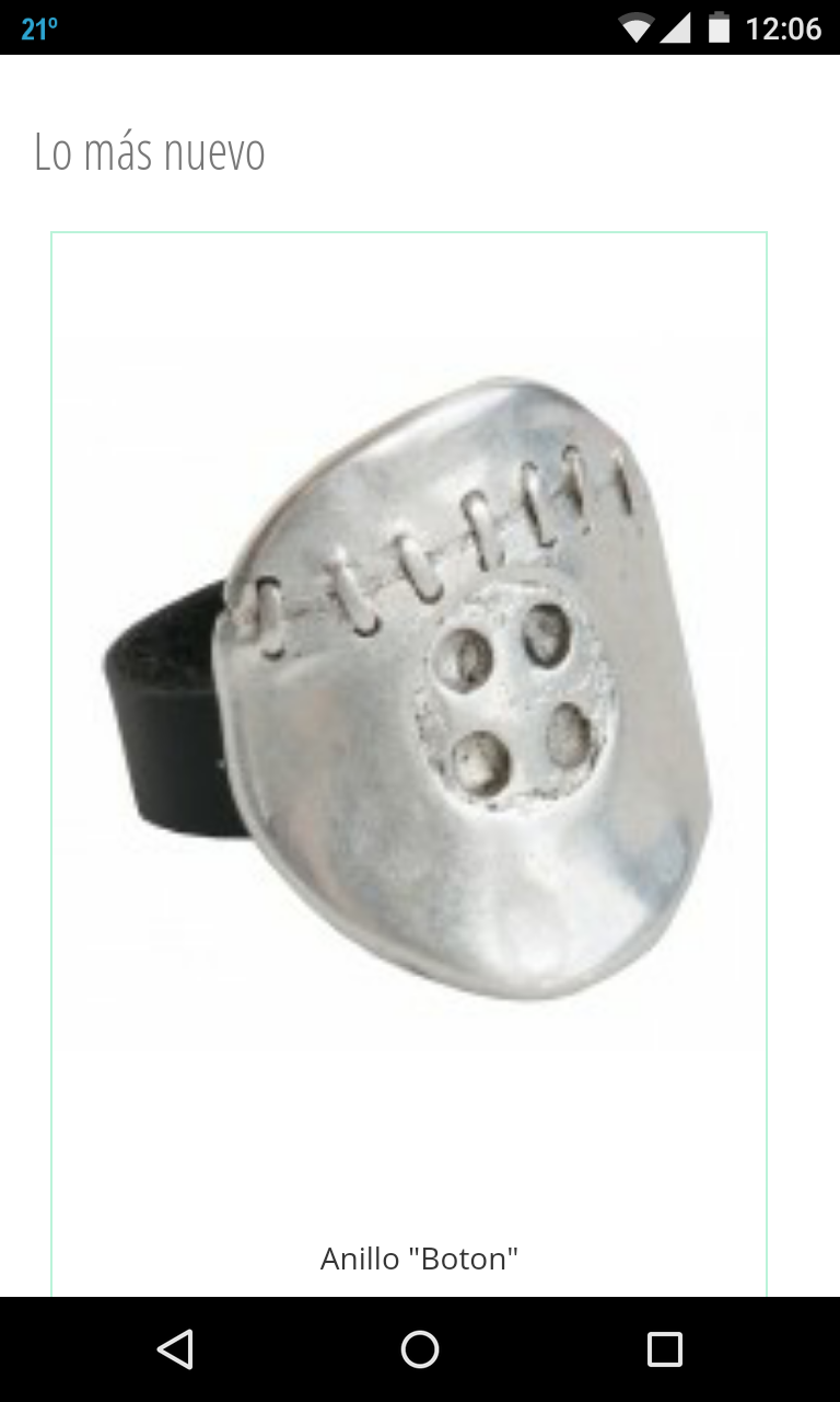
- Por qué la foto de los productos que aparecen en la portada, correspondientes a "Lo más nuevo", se ven algo grandes y borrosos? Adjunto foto. (Screenshot_2015-01.png)
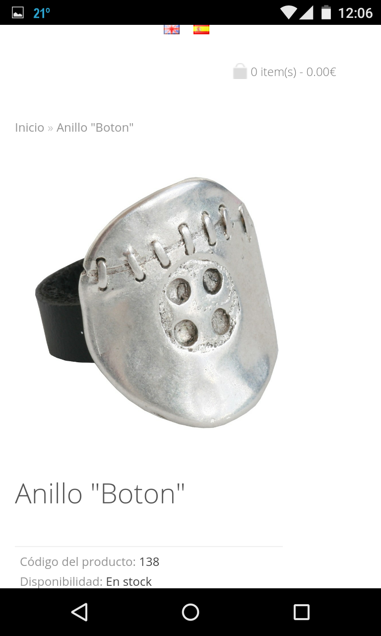
 - Sin embargo, cndo se clickea en la imagen, y ya se vé en su apartado o categoria correspondiente, la imagen se ve algo más pequeña, pero perfectamente definida. Adjunto captura de pantalla del movil. (Screenshot_2015-02.png)
 Eso por un lado,
Por otra parte, queria quitar el elemento "Busqueda" de la pantalla de inicio, y me he metido en responsive.css, borrando todo lo que tuviera que ver con #header.search y sobre todo con #search, pero aún así permanece el recuadro de Búsqueda, y encima va y se situa sobre el logo. Adjunto captura de pantalla del mv.
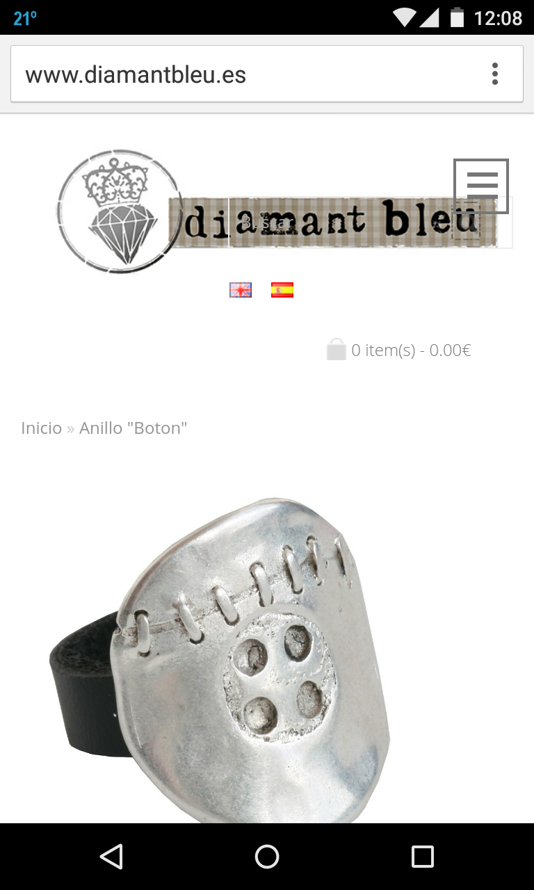 Como se puede ver, apenas se vé pq esta en color gris, xo el recuadro permanece sobre el logo; a ver si alguien puede ayudarme con esto,
saludos,
E.
Ned me gustaria retomar el tema, por si puedes ayudarme tu o el que tenga conocimiento suficiente.
Son dos dudas, la primera de las cuales es:
- Por qué la foto de los productos que aparecen en la portada, correspondientes a "Lo más nuevo", se ven algo grandes y borrosos? Adjunto foto. (Screenshot_2015-01.png)
Screenshot_2015-01.png (214.35 KiB) Viewed 1054 times
Screenshot_2015-02.png (320.67 KiB) Viewed 1054 times
Por otra parte, queria quitar el elemento "Busqueda" de la pantalla de inicio, y me he metido en responsive.css, borrando todo lo que tuviera que ver con #header.search y sobre todo con #search, pero aún así permanece el recuadro de Búsqueda, y encima va y se situa sobre el logo. Adjunto captura de pantalla del mv.
Screenshot_2015-03.png (403.66 KiB) Viewed 1054 times
saludos,
E.
Who is online
Users browsing this forum: No registered users and 12 guests


