
Any thoughts?
http://www.internetct.co.uk

I presume you are looking for feedback? I noticed a few very minor things you might look at. Only my opinion so might just be me?
Slow the slider down a touch
The dotted lines round the products are distracting
Using the traditional link blue colour for prices makes them look like links
The bricks don't convey 'computers' to me
Slow the slider down a touch
The dotted lines round the products are distracting
Using the traditional link blue colour for prices makes them look like links
The bricks don't convey 'computers' to me
Thanks TAC
The dotted lines are only around the 'Featured' products not all products. This was done in an effort to make them stand out more.
The brick background you refer to can be easily changed but I find it difficult to know what to use as background image.
I will try changing the Price from blue also.
Many thanks for your input

Hi there,
I have had a look at your website quickly. I have two quick points.
1. When I you adding links to your Ebay and Amazon account pages do you not want people to purchase from your site?
2. I would recommend that you use SEO Url's rather than the standard Opencart one. Its very easy to do if you need a hand please just give me a shout.
But overall you have a nice site.
Cheers
Good pictures will stand out more I think?
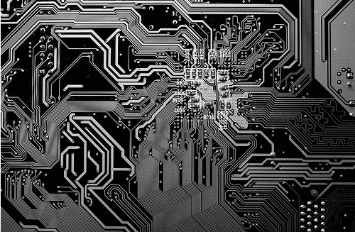
You don't have to have a background, could have a gradient colour? I suppose I was imagining something more 'computery' like this kind of patterns
but faded so it does not detract from your product images, and a blue to match the rest of the site.
If you like the idea let me know and I can recolour it for you
You don't have to have a background, could have a gradient colour? I suppose I was imagining something more 'computery' like this kind of patterns
Screen Shot 2014-05-08 at 14.19.58.png (213.49 KiB) Viewed 2998 times
but faded so it does not detract from your product images, and a blue to match the rest of the site.
If you like the idea let me know and I can recolour it for you
Yeah thanks TAC
I did toy with the idea of something more like this but couldn't get something I was happy with. If you don't mind re-colouring and fading this I am happy to give it a try.
Thanks
I did toy with the idea of something more like this but couldn't get something I was happy with. If you don't mind re-colouring and fading this I am happy to give it a try.
Thanks
Thanks Digital Helper. I have looked at the SEO Urls before but couldn't seem to make much sense of it.digitalhelper wrote:Hi there,
I have had a look at your website quickly. I have two quick points.
1. When I you adding links to your Ebay and Amazon account pages do you not want people to purchase from your site?
2. I would recommend that you use SEO Url's rather than the standard Opencart one. Its very easy to do if you need a hand please just give me a shout.
But overall you have a nice site.
Cheers
The left and right stick position items are being cut off on the edges.
I like your background, what about fading this one instead of using a new one?
I agree with the comment on the dotted lines, too distracting.
I like your background, what about fading this one instead of using a new one?
I agree with the comment on the dotted lines, too distracting.
kimbo
The Chloelina All Natural Soap Co.
chloelina.com
Thanks for your comments Kimbo. Do you realise that the dotted lines are only on the featured products and not all products. This was done to help them stand out from normal products as these are the 'Featured' ones.
Sorry joemaydew, I keep forgetting to log in here. Can you PM me your email address please.
The featured items have a Featured banner, are in a Featured box and leap out at you if you hover over them. The dots are not necessary
Just noticed the extra boxes at the sides, they only work in full screen so a lot of people won't see them anyway.
The featured items have a Featured banner, are in a Featured box and leap out at you if you hover over them. The dots are not necessary
Just noticed the extra boxes at the sides, they only work in full screen so a lot of people won't see them anyway.
Who is online
Users browsing this forum: No registered users and 2 guests


